
Letter Size for Signs at a Distance – Sign Letter Visibility Chart
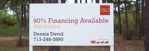
You love the sign for your business, from your logo to the colors. Have you taken the time to see how it looks from a distance? That perfect branding tool could end up being a problem if it’s not legible when someone is far away from it. You can avoid this problem by knowing how big your letters should be from a distance and the colors that improve its visibility.
Maximum Readable Distance
When you put together your sign design, you want to keep the sign letter visibility chart in mind. Choosing the letter size for signs at distance depends significantly on how far away people are. Massive letters are not useful if you’re simply trying to attract attention from foot traffic across the street.
The maximum readable distance on the letter size distance chart is a good starting place. You can learn how to space letters on a sign and how big they should be so that your message gets across to viewers. You also want to consider the optimal reading distance, as this is where the sign looks the best.
For example, three-inch-high letters are readable up to 100 feet away, but the ideal viewing area is 30 feet out. Ten-inch letters look great at 100 feet away, and they can be understood up to 450 feet away.
Letter Height Visibility Chart
Check out the table below, or download our printable letter visibility chart PDF today!
| Letter Height | Optimal Viewing Distance | Farthest Readable Distance |
|---|---|---|
| 3″ | 30′ | 100′ |
| 4″ | 40′ | 150′ |
| 6″ | 60′ | 200′ |
| 8″ | 80′ | 350′ |
| 9″ | 90′ | 400′ |
| 10″ | 100′ | 450′ |
| 12″ | 120′ | 525′ |
| 15″ | 150′ | 630′ |
| 18″ | 180′ | 750′ |
| 24″ | 240′ | 1000′ |
| 30″ | 300′ | 1250′ |
| 36″ | 360′ | 1500′ |
| 42″ | 420′ | 1750′ |
| 48″ | 480′ | 2000′ |
| 54″ | 540′ | 2250′ |
| 60″ | 600′ | 2500′ |
Pay close attention to the location of your sign and the potential viewing angles and distances. When you account for these details, you can get the biggest impact out of your business signage. A sign size calculator or a sign letter size calculator are excellent tools for figuring everything out.
Contrasting Colors
Another way to boost the readability of your signs comes from using the right colors. You must ask yourself what color can be seen from the farthest distance when you’re putting together a design.
High-contrast color schemes are ideal for distance-reading. While many contrasting colors offer adequate results, there are a few combinations that excel in sign readability.
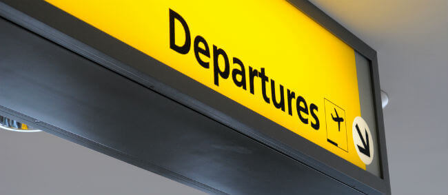
Black letters on a yellow background are the number one option. It pops out from a long distance. Similarly, striking options include white letters on black backgrounds, black letters on a white background, and yellow letters on black backgrounds.
Stay away from colors that have low-contrast when they’re put together. If you need a starting point for figuring out whether a pair is contrasting, you can refer to a color wheel. Look at the options on the direct opposite side of the wheel from your selected color. Common sense also applies. If a combination is high contrast but is uncomfortable to read in the graphic design program, then it’s not going to scale up well.
Fixing Existing Designs
You don’t need to completely scrap the designs that you sent to your sign company. One way to increase the readability of your letters is to outline all of them. The distinct border can make it easier to understand. If the design doesn’t look right with that effect, a drop shadow can create a similar effect.
A lot of resources go into planning, designing and deploying signs for your business. Evaluating their readability from a distance allows you to get the most out of your Houston advertising and marketing investment.
If you need help improving your sign letter visibility, request a quote from our experts at Houston Sign Company.