There are literally hundreds of thousands of fonts to consider in your search for the best sign font. Business sign design generally requires creativity, but when it comes to choosing the best fonts for banners and signs, we don’t recommend thinking outside the box.
After almost 75 years in service, our sign company in Houston has some valuable insights on finding the optimal font. In this article, we cover some of the factors you need to consider before choosing a font and eight of the best fonts for signs.
Factors for Choosing the Best Sign Lettering Font
The best font for large signs all depends on their unique purpose. While there is a short list of popular sign fonts that you should stick to, the one you choose will ultimately depend on what it aims to achieve.
Brand Guidelines
As a rule of thumb, successful businesses with refined processes have generally invested in professional branding and design at some point in their lifetime. Building a brand is an important part of creating a resilient organization. The brand guidelines that your business adheres to cannot be tossed out the window when it’s time to choose lettering for signs, posters, and banners.
You must try to follow the acceptable fonts that your branding expert laid out for your company. If your brand uses a serif, comic sans, or other script fonts that are considered poor letter styles for signs, you may have to make accommodations. Sans serif fonts (like the ones listed below) are typically a better option for any type of sign or banner.
Usage of Sign
Where is your sign being used? Are there legal standards (like ADA signage requirements) that limit you to certain fonts or minimum sizes? The World Wide Web Consortium also sets a contrast ratio of 3:1 for large-scale text under success criterion 1.4.3, which must be met if you’re representing your signage on your website as well.
The best warning sign fonts for construction site signs serve a very different purpose than the best font for retail signs. The best font for real estate signs is also very different because this signage is typically viewed from a vehicle, while the former examples are frequently seen by pedestrians.
The main thing to keep in mind is that there is no single answer to the question, “What is the best font for signs?” The best sign font ultimately depends on its use.
Capitalization Standards for Signs
Fonts have different strengths and weaknesses when you consider their upper-case vs. lower-case letters. A great outdoor sign font for a short message should generally be in all caps, while longer, more text-burdened messages benefit from lower-case letters.
Considering the length of your message in the context of your brand guidelines and sign usage can help you determine the optimal font for your signage.
8 Best Sign Fonts
From bold and modern to classic and sleek, these 8 eye catching fonts will help your signs catch eyes and leave a lasting impression. The best part? You don’t need to be a graphic designer to make a bold statement!
1. Gotham
This font is incredibly geometric and easy to read from a distance. With the right layout and color use, Gotham is simple to comprehend from a distance. The clean and modern feel of this lettering makes it a great choice for most brands. If you’re looking for a perfect font family with ‘bold’ or ‘black’ versions, Gotham is a great choice for storefront signs. Its strong, bold fonts and clear lines help with brand consistency, making it easy for customers to recognize your brand at a glance.
2. Helvetica
Helvetica is considered a very appropriate font for business usage and political campaign signs. This classic font generally won’t stray far from most brand style guides and can catch the eyes of both pedestrians and drivers with the proper design. As one of the most common display fonts, it offers versatility and marketing materials that can stand the test of time. Helvetica is one of the different fonts that easily blends with many fonts in various contexts.
3. Arial
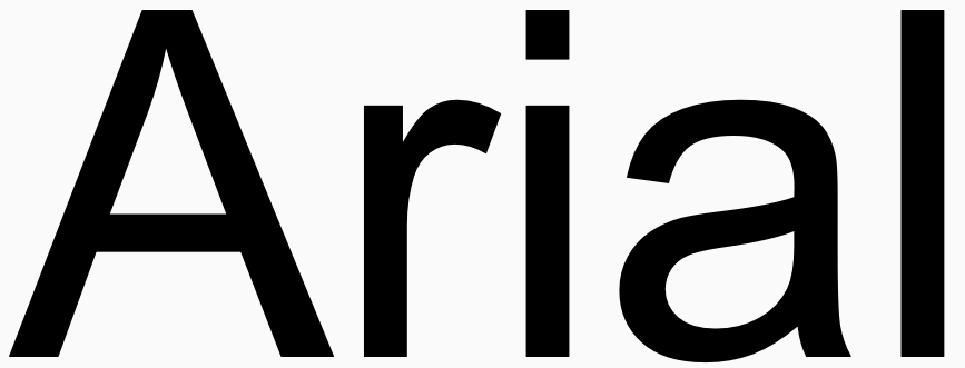
The strokes in this font provide great contrast within each letter by seamlessly flowing from thick and thin strokes. This contrast, paired with a partial serif, lands Arial among the best fonts for signboards and banners while remaining highly stylish. It’s perfect for storefront signs and other marketing materials that need to grab attention without sacrificing readability. Arial’s mix of simplicity and elegance makes it a solid choice for both bold fonts and more refined applications.
4. Proxima Nova
This sans-serif font lends itself wonderfully to both indoor and outdoor signs that need to attract attention. Its proportions and weight stress make it a great option for headlines and attention-grabbers. Proxima Nova is a great example of how display fonts can be used in both professional and casual settings, ensuring your design is visually appealing. It pairs well with other fonts to create a cohesive look across various platforms and marketing materials.
5. Open Sans
This is one of the best display board fonts, partially since it was designed specifically for Android mobile devices — a tool of choice for many designers today. Open Sans is a great font for headlines as well as body text in the right circumstances. Its clean, open design makes it a great fit for storefront signs, ensuring clear readability.
6. Franklin Gothic
A great way to give impact to your design is by using a font that stands out. This serif font works well for the details on your signage, and it also looks great as an all-cap headline. Franklin Gothic makes wonderful use of negative spacing within its letters and is very elegant and visually pleasing. As a bold font, it creates a striking presence on any sign or banner, helping maintain brand consistency and ensuring your message gets noticed.
7. Montserrat
When creating basic signs or banners with no certain requirements, you can’t go wrong with a font like Montserrat. This geometrically designed font is suitable for virtually any project, from storefront signs to indoor graphics. Its clean lines and modern look make it a go-to option for many brands seeking bold fonts and different fonts that create a memorable impact. It’s even one of our top picks at Houston Sign!
8. Univers
Univers is one of the most popular sans serif fonts used today. You’ll notice that these are all sans serif fonts, and the reason they are so common is that they are easier to read from a distance. You can’t go wrong with one of the classics!
Contact Houston Sign for Expert Sign Creation Today
From sign design consulting to printing, our local team can help you with Houston banner printing, poster printing, wall wraps, office & lobby signs, and everything in between.


